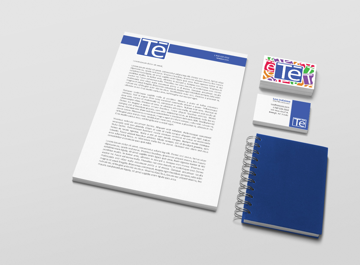
Identity and Package Design: Tē, a Spiced Tea Company
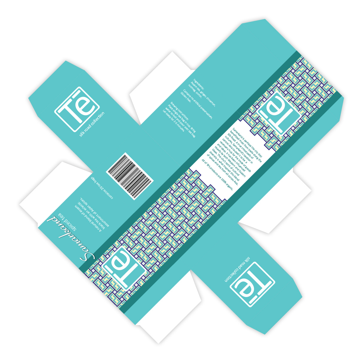
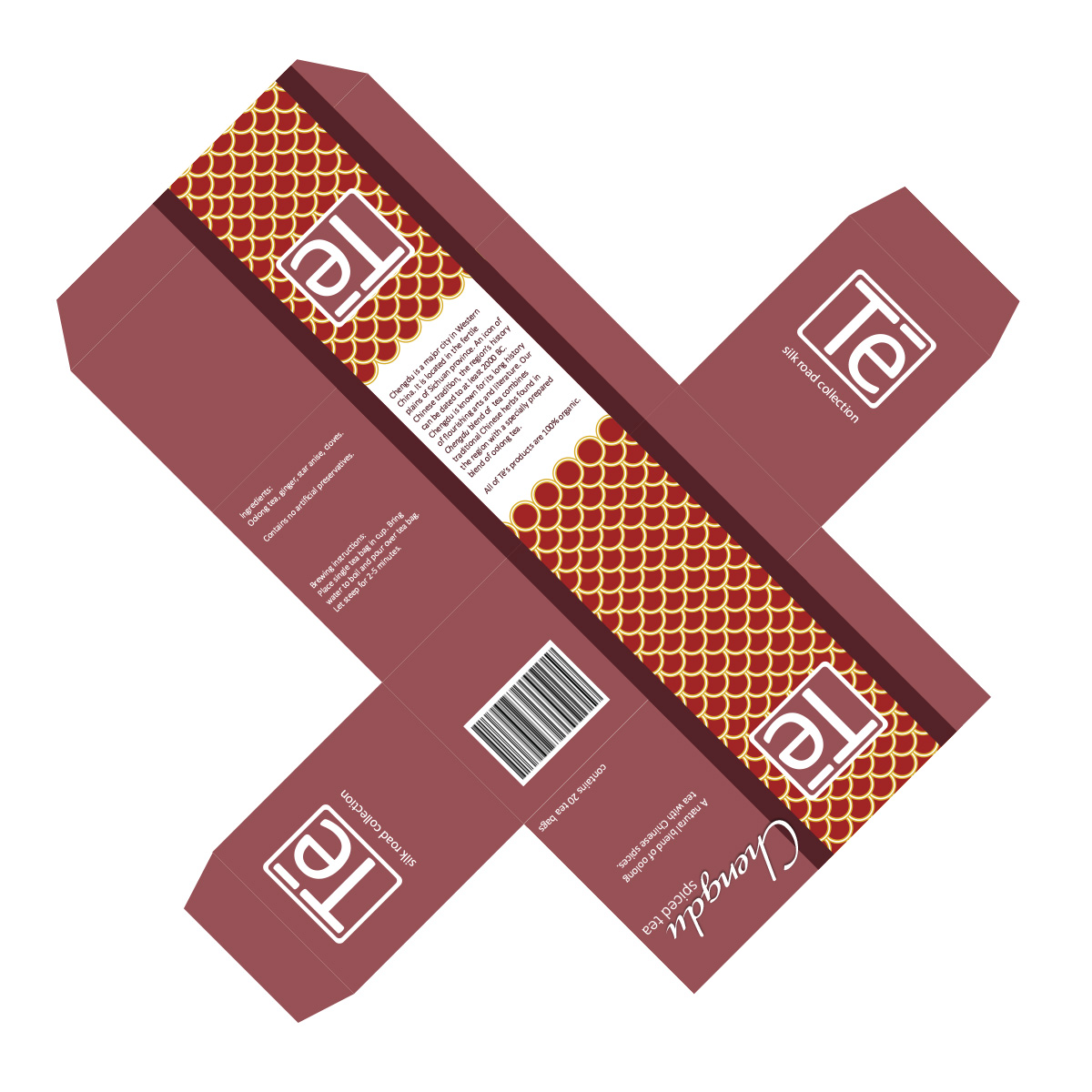
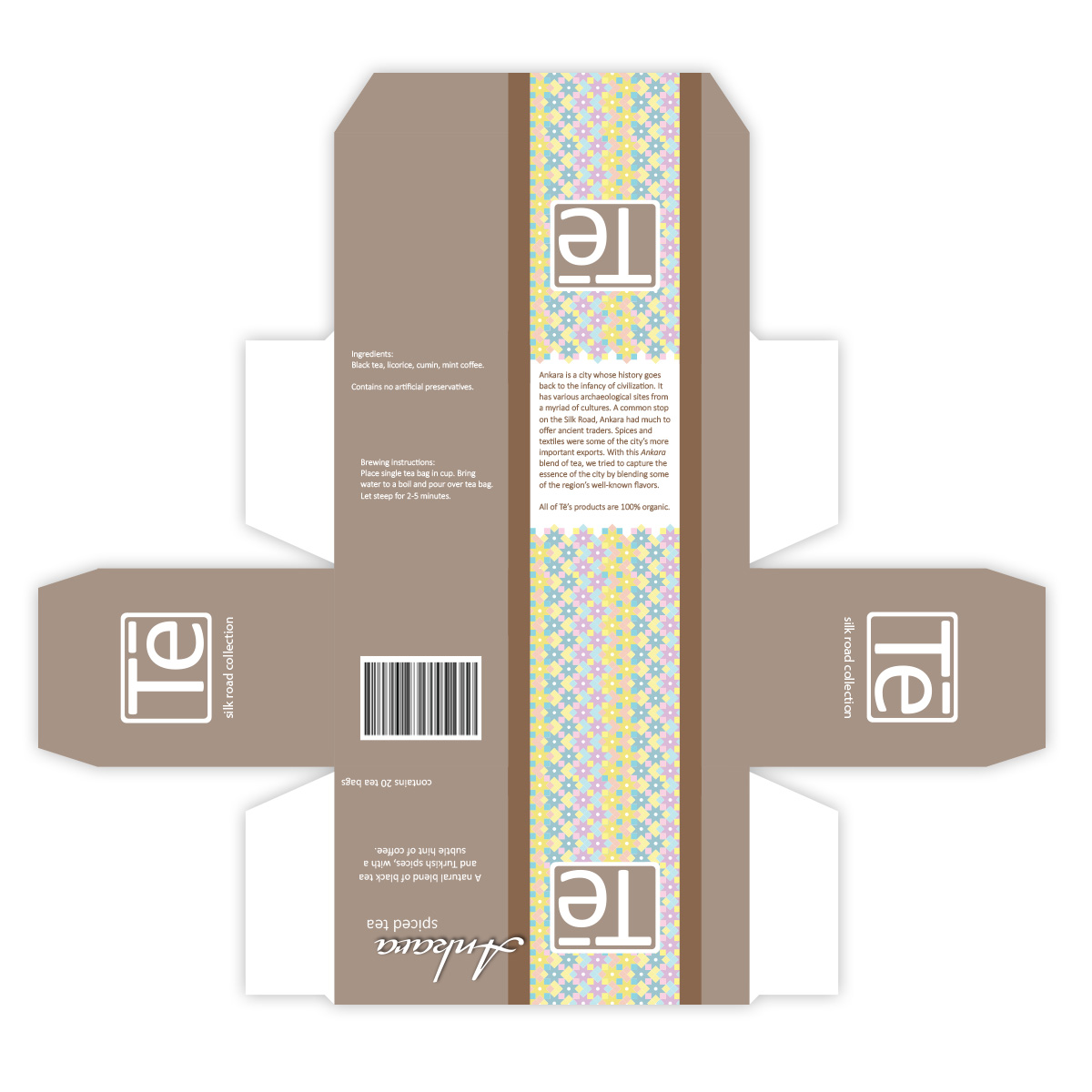
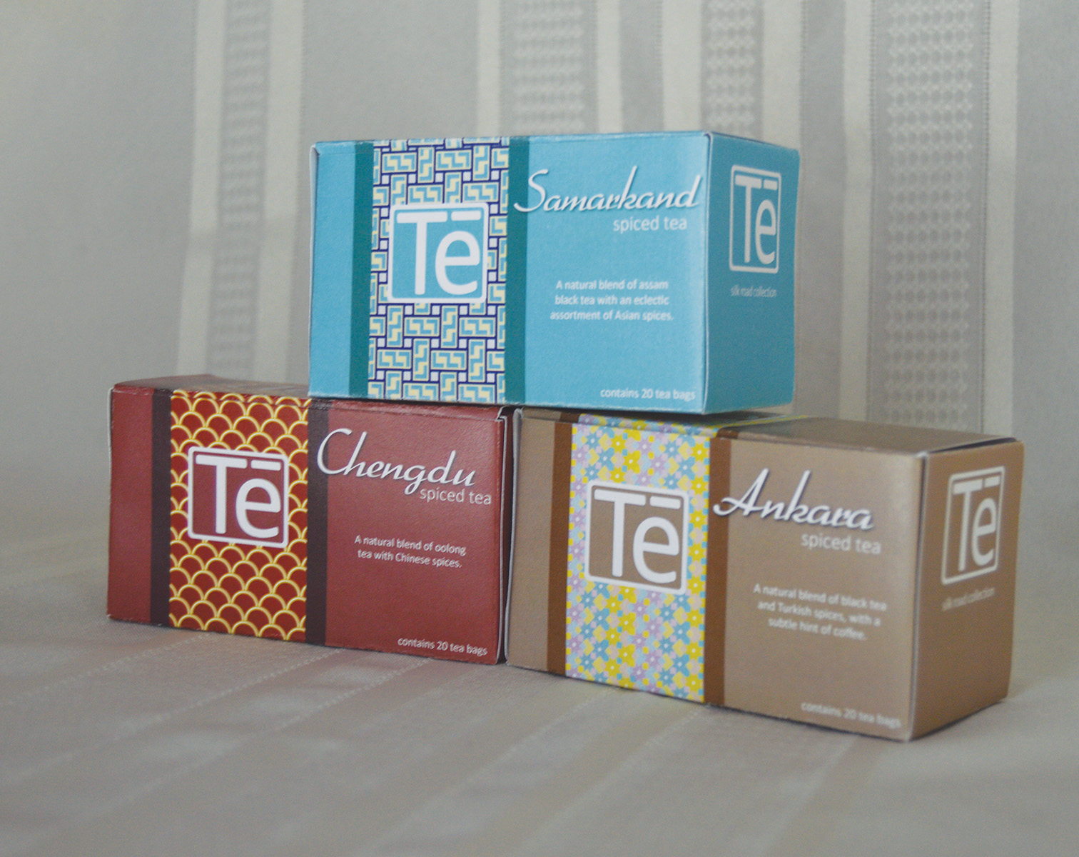
The brand idea for this company was that it would become a more “hip and modern” tea company. The project included a logo, business collateral, and packaging. The logo was designed with versatility in mind. The blue shown on the stationery is the classic logo, but the color can be changed to adapt the logo to different things, such as packaging or events. The stationery were designed with bold simplicity in mind. The packaging was designed specifically for a new “Silk Road Collection.” This collection features exotic spiced teas, and each spice blend is based on a different city along the Silk Road.
Similar Work